Litepie Datepicker is a date range picker component of Vue.js and Tailwind CSS and is based on day.js.
vue date range picker, date range picker jquery, date range picker html, date range picker npm, single calendar date range picker, date range picker vue native
How to make use of it:
Install and download:
# NPM
$ npm i litepie-datepicker
1. Import the Litepie Datepicker component.
import { ref } from 'vue';
import LitepieDatepicker from 'litepie-datepicker';
2. Register the component.
export default {
  components: {
    LitepieDatepicker
  },
  // ...
};
3. Add the component to the application.
<template>
  <div>
    <litepie-datepicker
      ref="myRef"
      v-model="dateValue"
    />
  </div>
</template>
Date Range Picker Component With Tailwind – Litepie
Description:
Litepie is a date and date range picker Vue.js component build with Tailwind CSS and day.js.
How to use it:
1. Import the Litepie Datepicker component.
import { ref } from 'vue';
import LitepieDatepicker from 'litepie-datepicker';
2. Register the component.
export default {
components: {
LitepieDatepicker
},
// ...
};
3. Add the component to the app.
<template>
<div>
<litepie-datepicker
ref="myRef"
v-model="dateValue"
/>
</div>
</template>
export default {
components: {
LitepieDatepicker
},
setup() {
const myRef = ref(null);
const dateValue = ref([]);
return {
myRef,
dateValue
};
}
};4. Customize the date format.
<template>
  <div>
    <litepie-datepicker
      ref="myRef"
      :formatter="formatter"
      v-model="dateValue"
    />
  </div>
</template>
export default {
components: {
LitepieDatepicker
},
setup() {
const myRef = ref(null);
const dateValue = ref([]);
const formatter = ref({
date: 'DD MMM YYYY',
month: 'MMM'
});
return {
myRef,
dateValue,
formatter
};
}
};5. Component props available.
overlay: Boolean,
asSingle: Boolean,
useRange: Boolean,
placeholder: {
type: [Boolean, String],
default: false
},
i18n: {
type: String,
default: 'en'
},
disableDate: {
type: [Boolean, Array, Function],
default: false
},
disableInRange: {
type: Boolean,
default: true
},
trigger: {
type: String,
default: null
},
autoApply: {
type: Boolean,
default: true
},
shortcuts: {
type: [Boolean, Function],
default: true
},
separator: {
type: String,
default: ' ~ '
},
formatter: {
type: Object,
default: () => ({
date: 'YYYY-MM-DD HH:mm:ss',
month: 'MMM'
})
},
modelValue: {
type: [Array, Object, String],
default: []
},
startFrom: {
type: [Object, String],
default: () => new Date()
},
options: {
type: Object,
default: () => ({
shortcuts: {
today: 'Today',
yesterday: 'Yesterday',
past: period => `Last ${period} Days`,
currentMonth: 'This Month',
pastMonth: 'Last Month'
},
footer: {
apply: 'Apply',
cancel: 'Cancel'
}
})
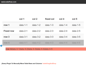
}Date Range Picker Component, Litepie Datepicker Plugin/Github
See Demo And Download
Official Website(kenhyuwa): Click Here
This superior jQuery/javascript plugin is developed by kenhyuwa. For extra Advanced usage, please go to the official website.

Be First to Comment