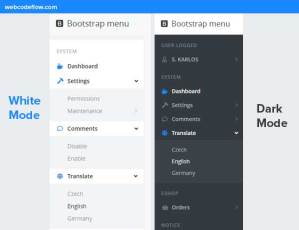
Responsive Menu is a mobile menu layout with flexbox and the use of Jquery that turns a normal menu into a toggle sliding menu, built using jQuery template and CSS3 flexbox.
mobile sliding menu, responsive menu download, slide out menu examples, responsive menu layout with flexbox
How to make use of it:
1. Create an html based navigation menu for your website.
<nav>
  <div id="toggle-menu">Toggle Menu</div>
   <ul class="menu">
     <li><a href="#">Home</a></li>
     <li><a href="#">Blog</a></li>
     <li><a href="#">Contact</a></li>
     <li><a href="#">About</a></li>
   </ul>
 </nav>
2. Style the menu and make it responsive with CSS3 flexbox and media queries.
@media screen and (max-width: 568px) {
.menu {
  padding: 0px;
  margin-top: 0px;
  margin-bottom: 0px;
  list-style: none;
  background: #C0392B;
  display: none;
}
@media screen and (min-width: 568px) {
.menu { display: flex; }
li {
  text-align: center;
  border-right: 1px solid rgba(0,0,0,0.2);
}
a { padding-left: 0px; }
}
li {
  flex: auto;
  border-bottom: 1px solid rgba(0,0,0,0.2);
}
li:last-child { border: none; }
a {
  color: #eee;
  text-decoration: none;
  line-height: 3;
  display: block;
  padding-left: 1em;
}
a:hover { background: rgba(0,0,0,0.2); }
#toggle-menu {
  background: rgba(0,0,0,0.7);
  border-bottom: 1px solid rgba(0,0,0,0.2);
  line-height: 2.5;
  color: #fff;
  padding-left: 1em;
  font-size: 0.9em;
  cursor: pointer;
}
@media screen and (min-width: 568px) {
#toggle-menu { display: none; }
}
3. Include the required jQuery library at the bottom of the web page.
<script src="//code.jquery.com/jquery-2.1.4.min.js"></script>
4. jQuery script to enable the menu toggle button on mobile devices (screen width < 568 pixels).
$('#toggle-menu').click(function(){
  $(this).next().slideToggle();
})
minimal responsive sliding menu, menu-responsivo Plugin/Github
See Demo And Download
Official Website(loogier): Click Here
This superior jQuery/javascript plugin is developed by loogier. For extra advanced usage, please go to the official website.
Be First to Comment